Contact
Chris Jones
Commercial director
Evi Hall
Managing editor

Chris Jones
Commercial director
Evi Hall
Managing editor
“Blue is one of the three primary colours in traditional colour theory, and arguably, it is the most mysterious.”
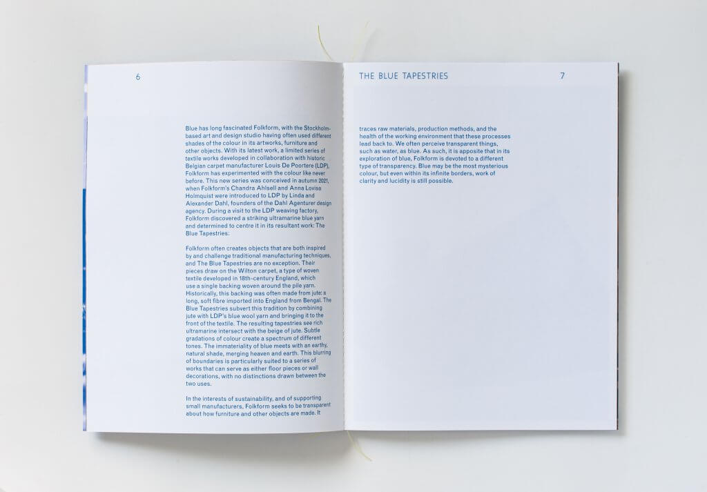
In September 2022, industrial design studio Folkform and carpet manufacturer Louis De Poortere hosted an exhibition called The Blue Tapestries as part of Stockholm Design Week. The exhibition displayed a series of Folkform’s textile artworks, each of which was woven from brilliant ultramarine yarn.
Alongside the exhibition, Folkform hoped to publish a catalogue that positioned its work as part of the rich history of the colour blue in at and design. As such, the studio turned to Disegno Works to write the catalogue’s introduction and related press release, asking for texts that played on the mystery and magic of the colour blue.
The resultant 400-word texts were built on initial research shared by Folkform to succinctly and poetically bring the studio’s project to life. The introduction delved into the history of the colour, while also giving important contextual information that highlighted the project’s stakeholders and the key ideas underpinning The Blue Tapestries.
The introduction text concludes: “Blue may be the most mysterious colour, but even within its infinite borders, work of clarity and lucidity is still possible.”
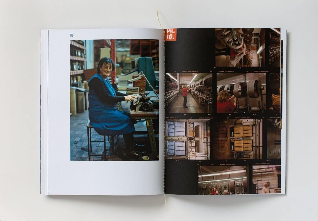
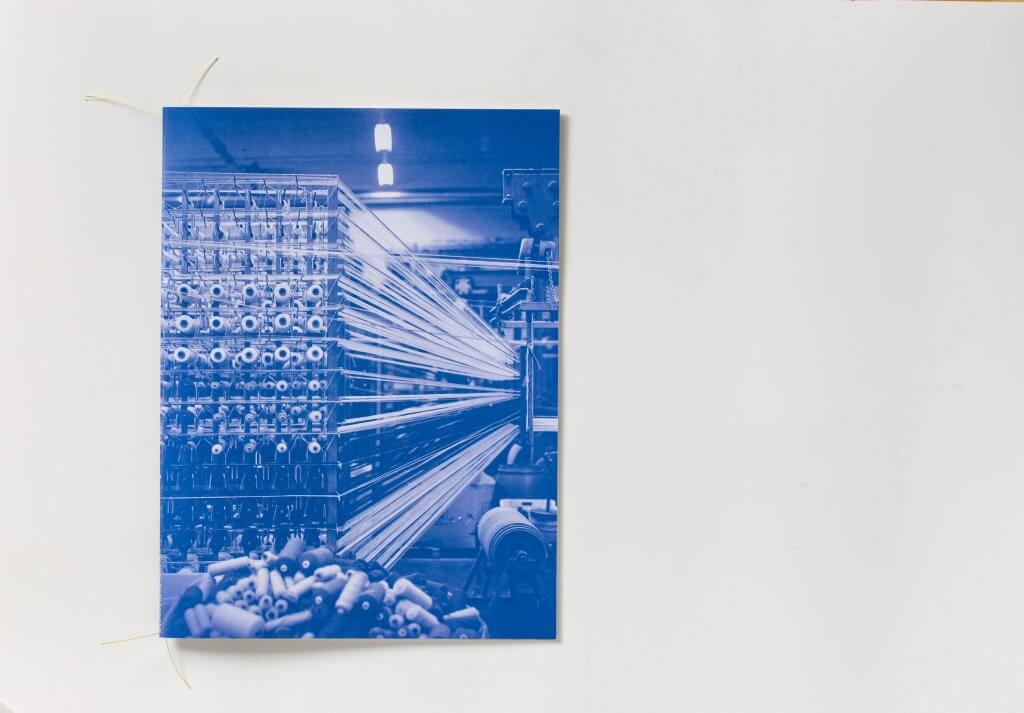
Images: Blue Tapestries publication.
Art direction by Folkform and graphic design by W.Andersson